Article: Modern Prints for a Bicycle-Inspired Entryway
Modern Prints for a Bicycle-Inspired Entryway
Choosing modern prints for a bicycle-inspired entryway is about more than finding a picture of a bike. The right artwork can make an everyday arrival feel considered, whether your bicycle hangs on the wall, rests beside the door or lives outside entirely.
Start with one cycling image that means something to you, then build the entrance around its proportions, colors and mood. A vintage bicycle advertisement can look thoroughly contemporary with restrained framing and enough breathing room. The aim is a welcoming space that reflects your interests without becoming crowded with sporting memorabilia.
Why bicycle artwork belongs by the front door
Bicycles have a natural connection to entryways: both belong to the daily rhythm of leaving, traveling and returning home. That makes cycling art especially appropriate here, rather than simply another decorative theme.
The bicycle also has a strong visual identity. Circular wheels, slender tubing and repeating spokes offer recognizable shapes without the visual weight of larger machinery. Even an illustrated cycling scene can introduce movement into a narrow hallway.
There is history behind that appeal. As Britannica’s history of the bicycle explains, the development of the safety bicycle in the late nineteenth century helped establish the familiar arrangement of similarly sized wheels and a chain-driven rear wheel. Cycling became associated with greater personal mobility as well as recreation.
That combination of useful engineering and freedom still resonates. For commuters, weekend riders and design enthusiasts, modern prints with cycling subjects can acknowledge a genuine interest while contributing rhythm and character to the room.
Start with a cycling scene, not a collection of accessories
Transit Art’s Cyclidéal artwork offers an approachable starting point: a vintage-style scene of a well-dressed couple cycling through a scenic landscape. Its appeal is as much about enjoying the journey as admiring the bicycle itself.
That distinction matters in a shared entrance. A sociable outdoor scene can appeal to the enthusiastic cyclist and the person who simply wants a welcoming home. It suggests leisure, companionship and travel without requiring knowledge of racing teams or equipment.
Let the poster establish the theme before adding bicycle-shaped hooks, miniature models or other decorative objects. One cycling image beside an actual bicycle often says enough. If the bike is stored elsewhere, a simple bench and an uncluttered surface can give the artwork the same prominence.
Choosing modern prints for a practical entryway
An entrance has to accommodate movement, bags, coats and opening doors. Plan the artwork around those activities rather than treating the wall as an isolated display.
Measure the usable wall, not just the empty wall
Open the front door fully, hang your usual coats and place your everyday bag where it normally lands. The remaining uninterrupted area is your real display space.
Above a console or bench, try an artwork or grouping roughly two-thirds the furniture’s width as a starting point. Adjust by eye rather than treating that proportion as a rule. A tall, narrow wall may suit one vertical piece better than a pair that stretches toward the doorframe.
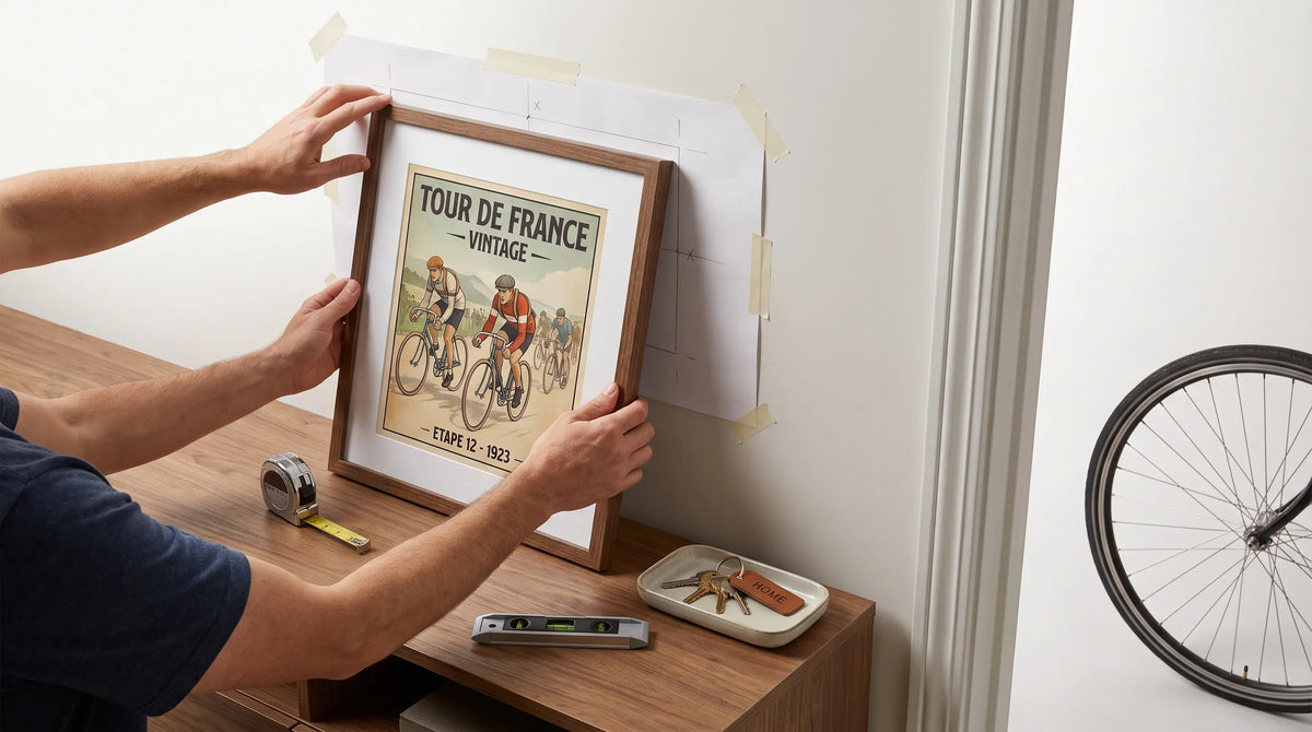
Use paper templates to test the complete framed dimensions before making holes. Check the arrangement from outside the room as well as directly in front of it. Entryway artwork is often first seen at an angle.
For a single piece, a center approximately 57 to 60 inches above the floor is a useful starting point. Furniture, sightlines and nearby switches may justify a different height.
Build a restrained palette around the artwork
When choosing modern prints for a small entrance, decide which element should attract attention first. If the bicycle frame is brightly colored, a quieter artwork and simple frame can keep the wall balanced. If the room is mostly neutral, the print can supply the strongest accent.
Choose one color from your selected artwork and repeat it once elsewhere, perhaps in a seat cushion or small tray. You do not need to reproduce every color in the image.
Black frames can echo bicycle tires and metal hardware. Light wood offers a softer connection to a bench or console. These are styling options, not requirements, and matching every finish usually matters less than keeping the overall arrangement deliberate.
Protect the print without obstructing the entrance
Keep artwork away from wet outerwear, scraping handlebars and the area where a bicycle leans against the wall. Use fixings appropriate to the wall construction and the framed piece’s weight.
Avoid prolonged direct sunlight where possible. UV-filtering glazing can help limit light exposure, but it does not eliminate fading. In a dim entrance, position lighting so that reflections do not obscure the image from the usual approach.
Leave coat hooks enough working space that a winter jacket cannot cover the bottom of the frame. A display that only looks good when the hallway is empty needs adjusting.

Recommended Poster Pairings
A bicycle-inspired entrance does not need to be exclusively about cycling, but the bicycle artwork should remain the anchor. These three Transit Art posters offer a core image and two optional companions for households whose interests extend into wider transport culture. Choose one companion rather than automatically displaying all three.
Cyclidéal: the cycling anchor
Cyclidéal – The Bicycle for Everyone is the most directly relevant choice for this scheme. The illustrated couple and scenic setting give the entrance a human story, rather than making it feel like an equipment showroom.
Place it on the first clear wall visible from the front door or above a compact bench. Its vintage character can sit comfortably within a modern interior when the surrounding furniture is simple.
For a cycling-led arrangement, give this poster the most prominent position. Any racing companion should support that first impression rather than compete with it.
1964 Targa Florio Ferrari Racing Poster: a road-going companion
The 1964 Targa Florio Ferrari Racing Poster features two scarlet Ferrari sports cars, numbered 150 and 128, moving through the Sicilian mountains against a cool forest backdrop.
First held in 1906, the Targa Florio became closely associated with demanding road racing in Sicily. This poster draws on Ferrari’s sports-car racing heritage rather than the history of a single identified road-car model. Its combination of mountain scenery, flowing bodywork and bold lettering will particularly appeal to enthusiasts of Italian motorsport and historic racing graphics.
For modern prints to work together here, connect them through framing and the shared idea of traveling through a landscape. The Ferrari poster makes sense beside Cyclidéal when both cycling and motoring are genuine household interests. Place it on a return wall or farther along the hall so that the bicycle scene remains the entrance’s main subject.
Monaco Grand Prix 1973: a graphic alternative
Monaco Grand Prix 1973 offers a different pairing direction, with side-view car illustrations, red text and a distinctly 1970s visual character. The product is listed as a giclée print on 200 gsm matte paper.
Monaco’s racing identity dates to its first Grand Prix in 1929. The event’s association with city streets makes this poster a fitting companion for someone interested in urban movement as well as cycling.
Choose it instead of the Targa Florio poster when you want the companion piece to emphasize graphic design rather than mountainous scenery. Matching frames can provide continuity between different illustration styles. A position above a key shelf or on the wall leading toward a home office would keep it connected to the entrance without crowding the cycling focal point.
Arrange the wall around how you arrive home
Before committing to a grouping, walk through your normal routine while carrying a bag. Check whether you can reach the light switch, use the hooks and move the bicycle without brushing a frame.
In a narrow entrance, one strong poster often works better than several small pieces. In a wider hallway, a cycling anchor and one transport companion can establish a sequence as you move through the space.
The spacing between modern prints should feel intentional, but it must also respect door trim, corners and furniture. Transit Art’s guide to creating a cohesive gallery wall with framed prints offers further ideas for connecting different subjects through consistent framing and spacing.
Keep the console surface quieter than the wall. A tray for keys and one useful light usually leave the artwork enough room to register.
Frequently Asked Questions
Can vintage bicycle posters work in a modern entryway? Yes. Simple frames, uncluttered furniture and a restrained palette let vintage illustration provide character without making the whole entrance feel period-styled.
Should the artwork match my bicycle’s color? It does not need to. Repeating one accent can create a connection, but coordinating the frame with nearby hardware or furniture is another effective approach.
Can I combine cycling and motor-racing posters? Yes, when both subjects reflect your interests. Keep the bicycle image prominent and use a consistent framing approach so the display reads as a considered transport collection.
Is one poster enough for a small entrance? Often, yes. A well-scaled piece can create a clearer focal point than a crowded grouping, especially when coats, storage and a bicycle already occupy the space.
Give your entrance a personal starting point
The most convincing modern prints are the ones that belong to your life as well as your room. Begin with the cycling scene you enjoy, test its position and let the surrounding space stay useful.
For a bicycle-first entrance, Cyclidéal provides that starting point. Add a racing companion only if it contributes a story you want to see each time you come home.