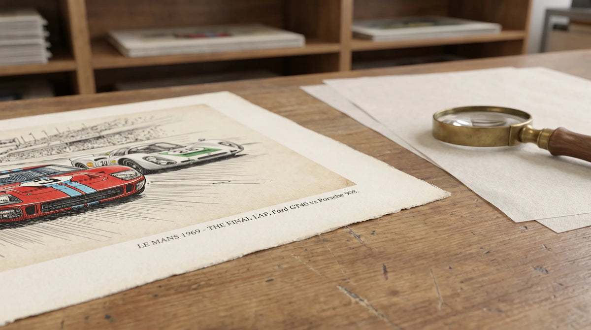
Article: How to Protect Vintage Framed Prints From Sunlight
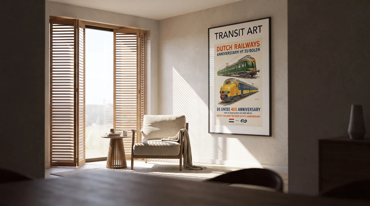
How to Protect Vintage Framed Prints From Sunlight
Protecting vintage framed prints from sunlight starts with placement, not just a better pane of glass. A steam locomotive poster may look striking beside a bright window, but repeated daylight exposure can gradually alter its colors and paper. UV-filtering glazing reduces part of that risk; it does not make a print sunproof.
The aim is to enjoy your artwork while limiting unnecessary exposure. That means choosing a sheltered wall, controlling daylight and using framing materials that support long-term care.
First, distinguish an antique print from a newly produced poster featuring vintage artwork. Their condition, materials and financial value may differ considerably. Both benefit from thoughtful display, but a fragile or valuable original deserves advice from a paper conservator before reframing. A modern reproduction offers another way to enjoy historic railway imagery without putting an irreplaceable original on permanent display.
Why vintage framed prints fade in sunlight
Light damage is cumulative and generally irreversible. Light can alter colorants and contribute to changes in paper, although the speed depends on the inks, paper, previous exposure and display conditions. Two prints hanging together may not age at the same rate.
Ultraviolet radiation is particularly damaging, but visible light also causes fading. This is why a frame advertised as UV-protective cannot guarantee that colors will remain unchanged indefinitely. Sunlight can also warm the framed assembly, adding another reason to keep artwork away from direct beams.
The Library of Congress guidance on caring for works on paper recommends limiting light exposure and avoiding direct sunlight. At home, that translates into controlling both brightness and the time a print spends illuminated.
For example, 200 lux for four hours and 100 lux for eight hours both equal 800 lux-hours. This illustrates cumulative exposure, not a universal safe allowance. Different materials and light sources can produce different outcomes.
Choose the wall before choosing the frame
For vintage framed prints, a sheltered interior wall is usually a better starting point than a wall that receives a daily patch of sunshine. Distance from the window alone is not enough: a beam can travel across a room and strike artwork several feet away.
Observe the proposed location in the morning, around midday and later in the afternoon. Repeat the check as seasons change, since the sun’s angle shifts throughout the year. A wall that stays shaded in summer may receive low winter sunlight.
Use this placement check before hanging:
| Display situation | Main concern | Practical response |
|---|---|---|
| Direct sunlight reaches the frame | Concentrated light exposure and possible heating | Move the artwork or block the beam reliably |
| Bright wall opposite a large window | Substantial indirect daylight | Add adjustable shades and consider a more sheltered wall |
| Interior wall away from direct beams | Lower exposure, though not zero | Combine suitable glazing with controlled lighting |
| Wall above a radiator or beside a fireplace | Heat and environmental fluctuations | Choose a different location |
Curtains, shutters and blinds let you reduce exposure when the room is empty. UV-filtering window film can provide another layer, but its performance varies and it does not remove the need to manage visible light. Check compatibility with your window glazing before installation.
Build protection into the framing
Ask what the glazing actually filters
The strongest protection for vintage framed prints combines sensible placement with documented UV-filtering glass or acrylic. Ask the framer which wavelengths the product filters and how its performance is measured, rather than relying on a broad label such as “protective glass.”
UV protection and reflection control are separate properties. An anti-reflective finish can make artwork easier to see, but that description alone does not establish its UV-filtering performance. Ordinary glass should not be assumed to provide conservation-level protection either.
Even well-specified glazing cannot prevent all fading because visible light still passes through it. Treat it as one protective layer, not permission to hang a favorite print in sunshine.
Keep paper away from the glazing
A window mat or suitable spacers should keep the print surface from touching the glass or acrylic. This gap helps avoid contact problems, including sticking if moisture develops inside the frame.
Ask for conservation-quality, acid-free and lignin-free mat and backing materials appropriate to the artwork. Mounting should also suit the print: valuable originals need professional, reversible methods rather than household tape, glue or permanent dry mounting.
Transit Art offers posters printed on FSC-certified paper, but responsible paper sourcing is a different consideration from resistance to light. Do not infer a particular lifespan or lightfastness rating from that certification.
For the visual side of framing, the guide to choosing mat borders for paper posters explains how border width and color affect the finished display. Check each product listing separately for what is included rather than assuming a poster arrives framed.
Interior design: preserve the daylight, shelter the artwork
You do not need to turn a bright living room into a dark storage space. Instead, separate the room’s brightest features from its most light-sensitive objects. Let daylight illuminate seating and architectural details while the artwork occupies a protected side wall.
A shaded display lets vintage framed prints remain a focal point through scale, contrast and arrangement rather than intense illumination. A dark frame can define a railway illustration against pale walls, while a warm-white mat creates breathing room around busy lettering and locomotive details.
For a Scandinavian-inspired room, restrained framing and a limited palette keep historic posters from overwhelming simple furniture. In an industrial home office, the same railway subjects can connect naturally with timber shelving and metal finishes.
Use dimmable LED lighting when extra illumination is needed, keeping fixtures far enough away to avoid heating the frame. Switch display lighting off when nobody is using the room. If you are planning several pieces, these principles for creating a cohesive gallery wall can help you coordinate frames and spacing without competing with the artwork.

Recommended Poster Pairings
Railway anniversary posters make a thoughtful pairing because they celebrate transport as both engineering and public spectacle. These two Transit Art designs share steam-locomotive imagery and a commemorative purpose, giving a display a clear story without requiring identical compositions.
100 Years of Dutch Railways Poster
The 100 Years of Dutch Railways Poster features a historic procession, a steam locomotive and Dutch flags in red, white and blue. The Netherlands’ first railway opened between Amsterdam and Haarlem in 1839, providing the historical starting point for the centenary theme.
The appeal extends beyond locomotive detail. Flags and ceremonial imagery show how railway development became a subject of national celebration. Train enthusiasts, readers of transport history and admirers of vintage graphic design can appreciate that combination.
In a sheltered living room or reading corner, let the flag colors supply a few restrained accents elsewhere, perhaps in a cushion or book spine. A quiet mat prevents the procession’s detail from feeling crowded.
Baltimore and Ohio Railroad Centenary Pageant Vintage Poster
The Baltimore and Ohio Railroad Centenary Pageant Vintage Poster marks the railroad’s 1827–1927 centenary with a steam locomotive set before a vibrant cityscape. Chartered in 1827, the Baltimore and Ohio became an important name in American railway history.
Where the Dutch design emphasizes a ceremonial procession, this poster connects the locomotive with an urban setting. Together, these vintage framed prints tell complementary stories about railways and the communities that celebrated them.
They suit a home office, hallway or living room wall outside the sun’s path. Use the same frame finish and mat color to unify the pair, but check their available dimensions before planning alignment. You do not need matching national color schemes: the shared anniversary theme and steam imagery already provide cohesion.
A simple routine for long-term care
Check the display periodically for new sun patches, especially after seasonal changes or alterations to curtains and furniture. If a frame feels noticeably warm, investigate the light source or nearby heating rather than accepting it as normal.
For vintage framed prints, reducing exposure now is more useful than waiting until fading becomes obvious. A reference photograph can help you document condition, although changing camera settings and lighting make photographs unreliable for measuring subtle color shifts.
Clean only the outside of the glazing using the method recommended by its manufacturer. Apply any permitted cleaner to the cloth, not directly to the frame, so liquid cannot run toward the paper. Do not open a valuable original’s frame or attempt to brighten faded colors yourself.
If you rotate artwork, store the resting piece in a dark, dry and stable location with appropriate protective materials. Rotation reduces display time; it does not reverse existing damage.
Frequently Asked Questions
Does UV-filtering glass completely prevent fading? No. It reduces ultraviolet exposure within its specified filtering range, but visible light can still damage sensitive materials. Combine suitable glazing with a shaded position and limited illumination.
Can I hang a print opposite a window? Sometimes, but assess how bright the wall becomes and whether direct sun reaches it at any time. A side wall with controlled daylight is often a better choice than the brightest wall opposite a large window.
Can sunlight damage a modern vintage-style reproduction? Yes. A historic design printed recently is still made from materials that may respond to light. Its vintage appearance does not establish its lightfastness or mean it needs less protection.
Can faded colors be restored at home? Light-induced fading cannot be reversed with routine cleaning. Avoid household treatments, sprays or attempts to recolor the print. Consult a paper conservator if the artwork has significant historical, financial or personal value.
Give railway history a considered place at home
The best setting for vintage framed prints balances enjoyment with care: a sheltered wall, appropriate framing and light only when it is useful. Start with those decisions before selecting the final arrangement. A thoughtfully placed railway poster can bring transport history into a modern room without relying on a sunlit wall to command attention.