Article: How to Choose Classic Posters for a Train Enthusiast
How to Choose Classic Posters for a Train Enthusiast
The best classic posters for a train enthusiast reflect what they love about railways, whether that is the drama of a steam locomotive, the elegance of an international express or the graphic language of old travel advertising. Choosing well means looking beyond a recognizable train. The subject, historical character and presentation should suit both the collector’s interests and the room where the print will hang.
Start with the railway interest
Before considering frame colors, establish what kind of railway story matters to the recipient. Someone who enjoys freight operations may prefer a working locomotive to a glamorous holiday destination. A fan of international travel might respond to an express-service poster rather than a technical illustration.
| Enthusiast’s interest | What to look for | What to check |
|---|---|---|
| Steam locomotives | Driving wheels, smoke and powerful silhouettes | Whether the locomotive is identifiable or stylized |
| Passenger travel | Express services and destination advertising | Whether the route or place has personal meaning |
| Railway operations | Freight, infrastructure and industrial subjects | Whether the artwork celebrates working railways |
| Graphic design | Strong lettering and simplified forms | Whether the composition works at the intended size |
For a gift, a remembered journey or favorite railway region is often a better starting point than a broadly nostalgic image.
Look for classic posters with convincing period character
Railway advertising once had a practical job: persuade people to travel. In the late nineteenth and early twentieth centuries, illustrated posters promoted destinations, services and the experience of taking the train. Their appeal today comes partly from that combination of useful information and visual imagination.
Look at how the design communicates movement. Diagonal tracks, a low viewpoint or a locomotive extending toward the viewer can make a static image feel energetic. Broad areas of color and distinctive lettering can remain effective across a room, where small mechanical details disappear.
Not every older-looking design is Art Deco. Judge the actual shapes, lettering and composition rather than relying on a style label alone.
Distinguish the historical image from the object being sold
An original railway advertising poster and a newly printed reproduction are different purchases. The former is a historical object whose condition, provenance and rarity affect its value. The latter lets you enjoy the imagery without shopping for an antique.
For everyday decorating, reproductions of classic posters let you prioritize the subject, dimensions and presentation. Check the product description for what is actually supplied, including whether a frame is included.
Transit Art describes its prints as made with gallery-quality materials and FSC-certified paper. Those are useful production details, but paper certification does not establish the age or provenance of the reproduced design. For more context on interpreting railway imagery, explore these examples of Dutch railway heritage in historical posters.
Recommended Poster Pairings
A train enthusiast’s wall does not need several nearly identical locomotives. A stronger arrangement can connect passenger travel with freight, or railway imagery with another transport interest. Start with a rail-only pairing, then consider a racing companion only if the recipient genuinely enjoys motorsport too.
Passenger travel and working railways
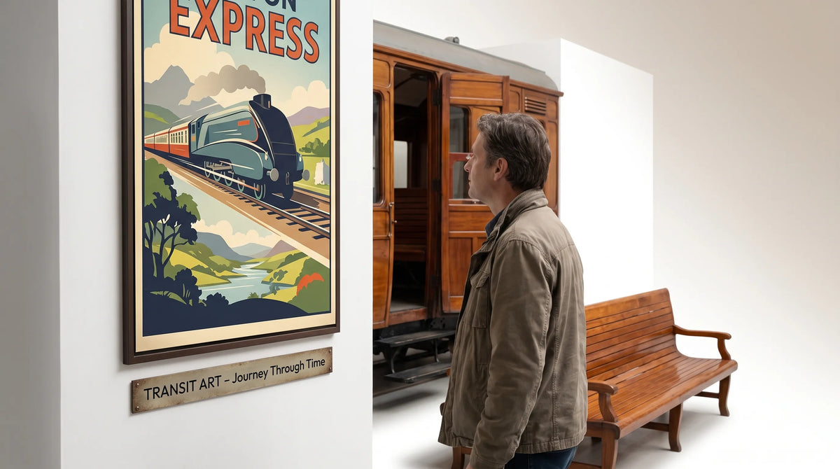
The Nord Express Vintage Travel Poster brings a streamlined train design and the atmosphere of early twentieth-century European rail travel into the room. It suits someone drawn to express services, travel history and the romance of long-distance journeys.
Pair it with the Dutch Railways Cargo Poster, which features a steam locomotive and bold red-and-blue coloring. The contrast is meaningful: one subject emphasizes passenger travel, while the other celebrates freight and the railway’s working role.
These classic posters share a transport theme without telling exactly the same story. Hang them above a home-office sideboard or along a study wall, using matching frames to connect their different compositions. Let the cargo print’s red or blue provide one restrained accent elsewhere in the room, perhaps in a book cover or cushion.
A railway centerpiece with a Budapest racing companion
For an enthusiast whose interests extend to historic motorsport, the 1936 Budapest Grand Prix Vintage Racing Poster offers a complementary advertising subject. Its red race car, Danube setting, hills and flags create a lively composition, with bold Art Deco lettering announcing the event.
The connection to railway art is visual rather than mechanical: both celebrate movement through illustrated transport advertising. Pair it with the Nord Express print in a study or hobby room, allowing the train image to remain the centerpiece.
The Budapest scene is racing artwork, not a railway record. It belongs in the arrangement because of a shared interest in period design and transport culture, not because every train enthusiast also likes cars.
A stronger color contrast from Zandvoort
The 1951 Zandvoort Grote Prijs van Nederland Poster is another option for a mixed-interest collection. A red number 7 race car advances toward the viewer against a bold green background, while white horses and a charioteer symbolize power and speed.
Beside the Dutch Railways Cargo print, it creates a Dutch transport pairing across two different subjects. Both use assertive imagery, so give them breathing room rather than surrounding them with several smaller pictures.
This combination works best on a relatively quiet wall in a study or den. Choose either the Budapest or Zandvoort companion unless the owner specifically wants a broader transport gallery; a railway-focused display does not need both.

Make the artwork fit the room
A poster can be historically interesting yet feel awkward in its intended space. Before choosing a size, measure the usable wall area and consider the furniture beneath it. Use paper templates to test the outer frame dimensions, not just the dimensions of the printed image.
Give the composition enough space
A single train print can create a clear focal point above a desk or narrow console. Two related prints often suit a wider sideboard, particularly when their frame edges or centerlines align.
View the proposed arrangement from the doorway as well as from close range. Lettering that looks impressive on a product page may become unreadable across the room. If the typography is central to the appeal, choose a display size that preserves its presence.
In modern interiors, classic posters usually need less supporting decoration than expected. A strong locomotive silhouette, a simple frame and an uncluttered wall can be enough.
Coordinate frames without matching everything
Slim black frames can echo the dark forms of locomotives and lettering. Natural wood can soften a transport-themed display in a Scandinavian-inspired room, while a restrained darker wood may sit comfortably with vintage furniture.
Use a consistent frame finish to unite different subjects. Identical mat widths can help too, although the openings should suit each composition rather than crop every image to the same proportions.
Avoid choosing wall paint solely to match one poster color. It is often easier to connect the artwork to a smaller furnishing, leaving the wall neutral enough for the image to stand out.
Check print details and protect the display
Before ordering, compare the available print dimensions with your chosen frame. Confirm whether the image has a printed border, whether any mat will cover its edges and whether framing is included. These small checks prevent an attractive print from becoming an awkward framing project.
Placement also affects longevity. The Library of Congress guidance on caring for works on paper recommends limiting light exposure and using suitable protective housing. Keep paper prints away from direct sunlight, damp walls and heat sources. For a valued piece, ask a framer about conservation-quality mounting materials.
For gifts, check the subject before the size. Someone who collects railway history may care more about the service or locomotive depicted than whether the colors match their sofa. Classic posters make more personal gifts when the image has a clear connection to the recipient’s interests.
If that connection is uncertain, a smaller, easily placed print is often more considerate than a large statement piece that requires rearranging a room.
Frequently Asked Questions
Are railway posters a good gift for every train enthusiast? They can be, but interests vary. Some enthusiasts prefer accurate locomotive depictions, while others enjoy travel advertising or station history. Look at the books, models and railway photographs they already collect before choosing a subject.
Should I choose a framed or unframed print? An unframed print gives the recipient more control over presentation. A framed option can be convenient when you know their taste and available wall space. Check the listing rather than assuming a frame shown in a display image is included.
Can railway and racing posters work together? Yes, when the owner enjoys both subjects and the images share a visual connection, such as strong lettering or a repeated accent color. For a dedicated railway enthusiast, a passenger-and-freight pairing is the more focused choice.
Choose a railway story worth living with
The most satisfying classic posters connect a personal interest with a composition that works in the home. Begin with the railway subject, confirm what kind of print you are buying and plan the framing before deciding on size.
A Nord Express-inspired travel scene and a working-railway image offer two distinct ways to celebrate that interest. Choose the story that matters most, then add a companion only when it makes the display more meaningful.