Article: How Studebaker Shaped Automotive Art and American Style
How Studebaker Shaped Automotive Art and American Style
How Studebaker Shaped Automotive Art and American Style
Studebaker’s place in automotive art begins with a willingness to look different. Its cars could be streamlined, theatrical or surprisingly restrained, sometimes within the same decade. That variety makes the marque an especially rewarding subject for anyone interested in the relationship between industrial design, illustration and the American home.
A Studebaker print offers more than nostalgia for a discontinued manufacturer. It can capture the optimism of postwar styling, the character of an everyday streetscape or the pleasure of owning something distinctive. Understanding that background helps you choose artwork for its visual qualities as well as its badge.
From Wagon Builder to Design-Minded Automaker
Studebaker began in South Bend, Indiana, in 1852 as a wagon-making business. It entered automobile production with electric vehicles in 1902 and gasoline-powered cars in 1904, eventually becoming one of America’s best-known independent manufacturers.
Its identity developed outside the enormous scale of Detroit’s largest companies. Distinctive styling became an important way to attract attention, especially as buyers increasingly associated a new car with personal taste and social aspiration.
For a deeper look at that transition, the Studebaker National Museum preserves vehicles and historical material connected with the company. Its history provides useful context for appreciating the cars as designed objects, not simply collectible machines.
Why Studebaker Stands Out in automotive art
Postwar optimism and the unmistakable front end
Studebaker’s 1947 passenger cars brought a fresh postwar appearance to American roads. The Starlight coupe’s extensive rear glazing made the passenger compartment unusually prominent, giving illustrators an interesting contrast between glass, bodywork and surrounding space.
The 1950 models took a more theatrical direction with their famous bullet-nose front treatment. That central circular feature made the car recognizable even when reduced to a small illustration.
For an artist, this matters: a memorable shape can carry a composition without requiring every mechanical detail. The nose, roofline or rear window becomes enough to establish the car’s identity.
The 1953 coupes and the power of proportion
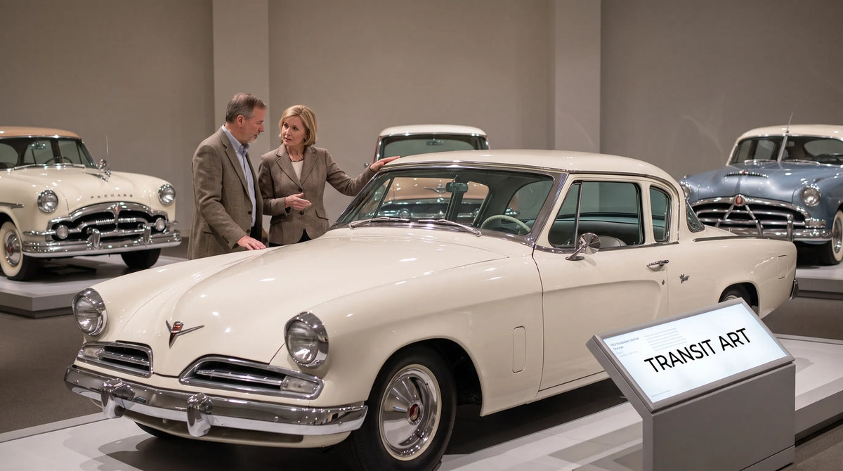
The 1953 Starliner hardtop and Starlight coupe offered a different kind of appeal. Their low profiles, long hoods and relatively restrained ornament created an elegant alternative to taller, more heavily decorated cars.
These designs emerged from Raymond Loewy’s organization, with Robert Bourke playing a central role. Crediting that collaboration matters because automotive styling was team-based work, even when advertising emphasized a famous designer’s name.
Their appeal in automotive art comes from proportion rather than spectacle. A side view can emphasize the balance between the wheels, cabin and body, making the vehicle compelling even in a quiet composition.
The Avanti and a more experimental American style
Introduced in 1962 for the 1963 model year, the Avanti pushed Studebaker’s design identity further. Developed by a team led by Raymond Loewy, it combined a fiberglass body with an unconventional front end that dispensed with a traditional upper grille.
Its sculpted surfaces suggested a different direction from the chrome-heavy image often associated with American cars. Studebaker was not expressing one fixed national style. Across these models, it explored several versions of modernity, from futuristic theater to clean-lined restraint.
A Street Scene Can Say More Than a Car Portrait
A perfectly isolated vehicle drawing invites you to study the machine. A street scene adds something else: evidence of how that machine belonged to everyday life.
Transit Art’s Studebaker at Whalley Avenue poster reproduces a gouache painting by Sune Envall depicting a classic Studebaker being collected from a car wash. The subject is an ordinary errand rather than a race victory or showroom unveiling.
That setting changes how the picture works. The car becomes part of a human routine, connecting automotive enthusiasm with care, ownership and a recognizable place. Gouache also brings the interpretation of a painted image, rather than the literal detail of a vehicle photograph.
This is where automotive art can reach beyond dedicated collectors. Someone may appreciate the Studebaker itself, while another viewer responds to the everyday narrative. In a shared living room, that broader appeal can make a car-themed picture easier to integrate than a highly technical illustration.
Bringing Studebaker’s Design Language Into a Modern Interior
Choose the atmosphere before the accessories
Decide what you want the room to feel like before choosing matching objects. A domestic street scene suggests a different atmosphere from a racing poster: more observational, less urgent.
In a living room with oak furniture, linen upholstery and pale walls, let the artwork provide the narrative interest. You do not need to add vintage signs, model cars and automotive cushions around it. One well-chosen picture can communicate an enthusiasm more clearly than a room full of themed accessories.
For a home office, automotive art can offer a personal counterpoint to practical furniture. Position the print where you can enjoy it away from the computer, perhaps above a low cabinet or on the wall beside a reading chair.
Borrow colors rather than recreating an era
Look at the actual print before selecting a frame or accent color. Choose one supporting tone from the artwork and repeat it subtly in a cushion, book cover or ceramic object.
This approach works better than assuming every Studebaker image needs red accents, chrome furniture or a diner-inspired setting. The picture’s own palette should lead the decision.
A simple wood frame can connect a street scene with warm, natural furnishings. A slim black frame gives the image a firmer boundary and can work well when combining it with more graphic racing posters. Neither requires the rest of the room to become deliberately retro.
Give the picture enough space
As a starting point, consider an artwork or grouped arrangement roughly two-thirds the width of the furniture beneath it. Adjust that proportion to suit nearby shelves, windows and the amount of clear wall available.
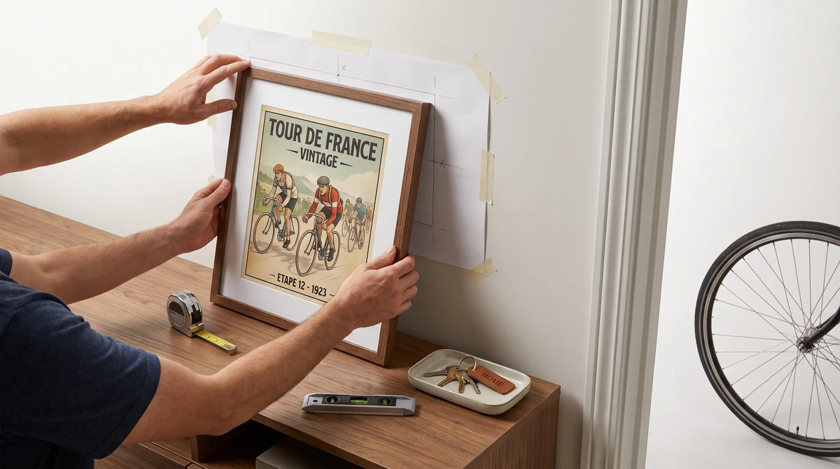
Before making holes, mark the outer dimensions with removable paper templates. Check the arrangement from the doorway and from your usual seated position. A picture that looks balanced while standing directly in front of it may feel too high above a sofa.
Keep framed works out of direct sunlight and avoid placing delicate paper prints where steam or splashes are likely. Good placement protects the object while making its details easier to appreciate.

Recommended Poster Pairings
A Studebaker street scene can anchor a small collection about different ways people experience cars. Rather than pretending every picture belongs to the same period or design movement, give the arrangement a clear theme: everyday ownership, racing spectacle and mechanical ambition.
These two posters offer complementary directions. They can work as individual companions to the Studebaker print or as part of a three-picture grouping.
1964 Targa Florio Ferrari Racing Poster
The 1964 Targa Florio Ferrari Racing Poster depicts two scarlet Ferrari sports cars, numbered 150 and 128, moving through a Sicilian mountain setting. Its forest backdrop and bold typography bring landscape and graphic structure into the arrangement.
Alongside the Studebaker scene, it creates a contrast between an everyday car-care ritual and the drama of endurance racing. Both pictures place vehicles within an environment rather than treating them as isolated objects.
This pairing suits a home office or living-room wall where you want some movement without filling the entire space with racing imagery. Keep the frames consistent and allow the Ferrari poster’s red cars to provide the strongest accent.
German Rivals
German Rivals features an Auto Union Type D sliding through a curve. Its racing subject introduces a different engineering tradition and a more concentrated sense of action.
Paired with the Studebaker, it broadens the collection from American road culture to European competition. The connection is the expressive shape of the automobile, not a shared manufacturer or event.
In a study or reading area, these works can sit on adjacent walls so each retains its own mood. If you prefer a more energetic grouping, Transit Art’s guide to bringing track-day energy into your decor explores that direction further.
The strongest automotive art arrangement does not require identical subjects. It needs a readable relationship, supported by consistent framing, considered spacing and a sensible balance of quiet and active images.
Carry the Theme Into an Everyday Object
Not every expression of automotive enthusiasm needs more wall space. The Studebaker at Whalley Avenue mug carries the same car-wash scene onto an 11-ounce ceramic mug.
That makes it a useful companion for someone who enjoys the artwork but has limited room for prints. It also offers a gift option when you know the recipient likes classic cars but do not know their preferred frame size or wall layout.
If you already display the poster, let the mug remain a functional object rather than building an entire matching display around it. Repetition is most effective when it feels incidental.
Frequently Asked Questions
Why are Studebakers interesting subjects for automotive art? Their distinctive silhouettes offer several visual directions, including the 1950 bullet nose, the restrained proportions of the 1953 coupes and the unconventional Avanti. Artists can emphasize recognizability, elegance or experimentation depending on the model and composition.
Does Studebaker artwork only suit vintage interiors? No. A simple frame and restrained placement can make it work in contemporary rooms. Choose the image for its composition and palette rather than surrounding it with period-themed accessories.
Can American car prints work beside European racing posters? Yes, when the relationship is intentional. Connect them through painted interpretation, vehicles in their surroundings or the contrast between road use and competition. Consistent framing helps different subjects read as a collection.
Choose a Story You Want to Live With
Studebaker’s contribution to American style lies partly in its refusal to look entirely predictable. Its cars offer memorable shapes, but their artistic appeal also comes from the lives and places around them.
For a room that feels personal without becoming heavily themed, begin with one image whose story holds your attention. A Studebaker returning from the car wash can be enough: a distinctive machine, an everyday moment and a thoughtful connection between design history and home.