Choosing Artistic Posters With Bold Vintage Typography
Choosing Artistic Posters With Bold Vintage Typography
The most memorable artistic posters do more than show an interesting subject. Their lettering becomes part of the picture: a festival name establishes scale, a brand name gives the composition rhythm and a few carefully placed words suggest movement. For transport enthusiasts, that combination offers something a vehicle photograph cannot always provide: a connection to the graphic culture surrounding the machines.
Choosing one for your home means looking beyond whether you like the motorcycle or bicycle depicted. Consider how the words, colors and shapes work together, then give that composition enough space to make an impression.
What makes vintage typography worth displaying?
Transport advertising had a practical job: attract attention and communicate quickly. That purpose produced an appealing tension between information and expression. Lettering needed to identify a manufacturer, destination or event, but it could also make speed, elegance or excitement visible.
Different letterforms create different moods. Narrow, condensed capitals can feel purposeful and energetic. Broad geometric lettering has a more architectural presence. Hand-drawn characters introduce irregularities that make a design feel distinctly unlike a contemporary digital template.
Look for a relationship between the words and the illustration rather than treating typography as decoration added afterward. A strong headline might counterbalance a rider leaning into motion, echo the vertical shapes in a composition or establish a calm horizontal line beneath a busy scene.
The most useful test is simple: would the poster lose much of its character if you removed the lettering? If the answer is yes, typography is doing meaningful visual work.
A 1958 motorcycle festival as a starting point
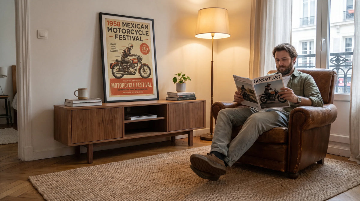
For artistic posters with a specific cultural story, event advertising offers an alternative to familiar manufacturer logos. Transit Art’s 1958 Mexican Motorcycle Festival Poster presents the “Primer Festival Mexicano de Motociclismo” at Circuito Satélite in Ciudad Satélite, Mexico.
The design combines angular pillars in red, yellow, blue and purple. Those architectural shapes give the composition an energetic structure, making it interesting even before you read the event information. Rather than celebrating one motorcycle model, the subject connects motorcycling with a particular place and gathering.
That distinction matters when decorating. A manufacturer-focused print expresses loyalty to a marque; a festival poster can express a broader interest in motorcycle culture, Mexican graphic design or midcentury advertising. It can appeal equally to a rider and to someone attracted by its color relationships.
Treat the 1958 date as part of the historical artwork’s identity. It does not mean a newly purchased reproduction is an original sheet printed in 1958. Keeping that distinction clear helps you appreciate the design without confusing decorative art with collectible ephemera.
How to assess artistic posters before ordering
A compelling subject is only the beginning. Before choosing a size, examine the composition at two distances: close enough to appreciate the lettering and far enough away to judge its overall shape.
Look for a clear hierarchy
Identify what you notice first, second and third. A successful design might lead with the festival name, move toward a colorful illustration and finish with smaller location details. Not every word needs equal prominence.
Condensed lettering can fit a long name into a narrow space, but dense text may become difficult to distinguish in a small print. Conversely, a broad headline can remain visually strong even when you cannot read the supporting details from across the room.
Try reducing the product image on your screen. This does not predict print sharpness, but it can reveal whether the composition retains a clear focal point.
Separate historical texture from reproduction problems
Older designs may contain uneven ink, textured backgrounds or imperfect letter edges. Those characteristics can belong to the source artwork. Blurred text and obvious pixelation, however, deserve closer inspection.
For artistic posters that rely on typography, inspect the smallest lettering in any available detail images. If the listing does not provide a close-up, ask about the source image and suitability for your intended print size rather than assuming a larger option will reveal more detail.
Transit Art describes its poster offering as using gallery-quality materials and FSC-certified paper. FSC certification concerns material sourcing; it does not, by itself, establish paper weight, color accuracy or archival lifespan. Check those specifications separately when they matter to your purchase.
Interior design: let bold lettering have breathing room
A typographic poster already contains visual activity. Surrounding it with patterned wallpaper, open shelving and several competing signs can make a room feel crowded, even when each item is attractive individually.
Start with one dominant composition and repeat only a small part of its palette elsewhere. With the Mexican festival design, you might pick up the blue in a cushion or the yellow in a small ceramic object. You do not need accessories in every color shown.
Match the composition to the room
In a restrained living room, a colorful event poster can provide the main accent against pale walls and simple furniture. In a home office, bold lettering introduces personality without requiring a room full of automotive memorabilia.
Midcentury-inspired interiors suit the combination of geometric forms, warm wood and confident color. In an industrial room, the same artwork can soften the severity of metal furniture and dark finishes. The connection comes from proportion and palette, not from making every object look vintage.
Measure the available wall area before selecting a print. Include the frame’s outside dimensions, not just the image size. Painter’s tape or a paper template will show whether the proposed artwork feels substantial enough above a desk or console. Transit Art’s guide to choosing prints that look good from across a room explores that viewing-distance question in more detail.

Choose a frame that supports the lettering
A slim black frame can give colorful artwork a clear boundary. Light wood offers a gentler transition into pale walls and timber furniture. Either can work, provided the frame does not become more visually insistent than the poster.
Check the image proportions against the frame opening. Do not crop away dates, location lines or the edges of large letters simply to fit an existing frame. A mat can accommodate different proportions while giving a dense composition additional space. Keep paper artwork away from direct sunlight and damp locations.
Recommended Poster Pairings
The most convincing groups of artistic posters share a visual connection without repeating the same composition. Use the Mexican festival print as the colorful anchor, then choose one or both of these complementary Transit Art designs.
Vintage Favour Cycles & Motorcycles Poster
The Vintage Favour Cycles & Motorcycles Poster features an Art Deco-style scene with a motorcyclist racing ahead of a cyclist. It offers a useful contrast to the festival print’s angular pillars: one composition emphasizes moving figures, while the other brings a more architectural arrangement.
Their shared connection to motorcycling keeps the pairing coherent without requiring identical imagery. Display them above a home-office credenza or along an entryway wall, using matching frames to connect the different designs. Compare the product images side by side before deciding which should take the larger format.
Armor Cycles: Stylish and Swift
Armor Cycles: Stylish and Swift depicts a woman riding a green bicycle against a deep blue background. That blue provides a color connection to the Mexican festival design, while the bicycle broadens the group from motorcycling to transport culture.
This pairing suits a reading corner, dining area or shared workspace where a quieter cycling subject can balance the festival print’s multiple colors. If you display all three posters, keep either their frame finishes or their overall framed heights consistent. The images can vary; the presentation should supply the order.
Check the details that affect the finished wall
Before ordering, confirm the selected dimensions, whether a frame is included and how the print will fit your planned arrangement. Product photography may show styling that is separate from the item being sold.
For historical reproductions, look for artist attribution and information about the source artwork where available. A vintage appearance alone does not establish authorship or reproduction rights. Avoid assigning a designer to an unsigned work without reliable documentation.
Finally, review the seller’s current shipping and return terms. Screen colors vary, so assess the actual print in your room’s daylight before choosing accessories around a precise shade. These checks are more useful than relying on a styled product image alone.
Frequently asked questions
Do artistic posters need to match the room’s existing colors? They need a relationship with the room, not an exact match. Repeat one accent color or connect the artwork through its frame finish. A contrasting poster can work well when the surrounding furnishings remain restrained.
What size works best for vintage typography? Choose according to viewing distance, available wall space and the density of the lettering. Small supporting text may remain a close-view detail even in a larger print. Measure the complete framed footprint before ordering.
Can I mix motorcycle and bicycle posters? Yes. Shared transport themes, related colors and consistent framing can create cohesion. Varying the subjects often produces a more interesting wall than repeating nearly identical designs.
Should a vintage poster reproduction look perfectly clean? Not necessarily. Source artwork can include age-related texture or printing irregularities. Distinguish those characteristics from low-resolution reproduction, especially around small letters and fine lines.
Choose the design you want to live with
The right poster should reward both a quick glance and a closer look. Bold lettering supplies immediate presence; the event, place or transport history gives you something to return to.
Start with the artwork that genuinely interests you, whether that is the 1958 Mexican festival design or a cycling advertisement. Then choose its size, frame and companions around the room you actually have. A carefully considered pair will usually feel more personal than a crowded wall assembled only to match.