Home Interiors Prints That Make a Room Feel Personal
Personal rooms rarely come from matching sets. The most memorable home interiors prints do more than coordinate with a sofa or fill a blank wall. They point to the places, machines, journeys and eras that mean something to the person living there. A print can remind you of a harbor town, a first road trip, a family story or a design period you keep returning to. That emotional hook is what separates a room that looks styled from a room that feels inhabited.
Start with the story you want the room to tell
Before choosing a frame size or color palette, decide what the room should say about you. A living room might say you love slow coastal travel. A hallway might say you are drawn to industrial forms, old rail stations and the romance of departure boards. A study might say you admire engineering, craftsmanship and historic detail.
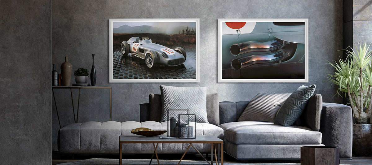
This is where transit-inspired artwork works especially well. Ships, cars, motorcycles, bicycles, aircraft and trains are not just objects. They carry associations of freedom, place, speed, memory and design. A vintage travel poster can make a quiet corner feel cinematic. A classic automotive print can add grit to a clean modern space without making it feel cluttered.
The key is to choose from recognition rather than trend. If a piece makes you pause because it feels connected to a place you have visited, a vehicle you admire or a mood you want to bring home, it has a stronger chance of lasting. For that reason, home interiors prints work best when they begin with personal meaning rather than a blank-wall problem.
Choose artwork with personal anchors
A good way to evaluate home interiors prints is to ask whether the subject gives the room a point of view. Not every print needs a dramatic backstory, but it should add more than pattern. The best pieces become small anchors for conversation, memory or atmosphere.
For a study, library or hallway, a historic maritime subject can bring structure and quiet authority. The HMS Victory Portsmouth Poster is a strong example because its vintage presentation, intricate rigging and connection to the ship’s 1805 period restoration give the image more depth than a generic nautical print. It suits rooms where you want a sense of heritage, craft and order.
For a brighter room, especially one with warm neutrals, woven textures or coastal references, the Marseille "Point de Départ de la Côte d'Azur" Vintage Poster brings a different kind of personality. Its stylized port scene, Mediterranean setting, ship and luxury car create a travel mood without needing the room to become themed.
Size, color and placement for home interiors prints
Once the subject feels right, scale and placement decide whether the print looks intentional. A beautiful poster hung too high, too small or too isolated can feel like an afterthought. A simple rule is to let the print relate to the furniture beneath it. Over a sofa, sideboard or bed, the artwork should feel visually connected to the object below rather than floating on the wall.
Use size to create confidence
Small prints can be elegant, but they need context. A single small frame often works best on a narrow wall, beside a reading chair or as part of a pair. Larger prints suit rooms with fewer objects because they give the eye a clear focal point. If you are decorating an open-plan space, one confident transit print can help define a zone, such as dining, working or relaxing.
Multiple sizes also give you flexibility. A compact print can personalize a desk wall. A larger poster can carry an entire room. Canvas wall art can work well when you want more object presence and less reflection from glass.
Let color echo, not copy
A print does not need to match the room perfectly. In fact, exact matching can make a space feel flat. Look for two or three colors in the artwork that echo existing tones in the room, such as wood, upholstery, metal finishes, rugs or books.
| Room type | Print mood that works well | Why it feels personal |
|---|---|---|
| Living room | Coastal travel, classic cars, bold vintage posters | Creates a focal point with a story |
| Home office | Ships, aviation, engineering subjects | Adds focus, structure and curiosity |
| Bedroom | Softer palettes, boats, bicycles, scenic routes | Feels calm without becoming generic |
| Hallway | Strong graphic posters or narrow framed pairs | Turns a pass-through space into a gallery moment |
| Dining area | Mediterranean ports, rail travel, retro tourism | Encourages atmosphere and conversation |

Mix vintage, modern and transit-inspired pieces
A room feels more personal when it looks collected over time. That does not mean the art has to come from many places, but the selection should include contrast. Pair a polished vintage travel poster with something more rugged. Place a refined coastal vessel image near a bolder automotive subject. Mix warm paper tones with crisp modern framing.
The easiest way to keep home interiors prints from feeling like a showroom set is to vary the energy of each piece while keeping one shared thread. Transit and vehicle culture give you that thread naturally. A ship poster, a car print and a railway-inspired design can all belong together because they speak the language of movement, even if their colors and eras differ.
For a maritime grouping, a piece like S/S Saltsjön can sit comfortably near historic naval artwork because both draw on vessel culture without repeating the same image. If you prefer a rougher, more industrial note, Citroen Wreck can add texture and contrast to a wall that might otherwise feel too polished.
Make prints feel collected instead of decorated
The difference between decorated and collected is often restraint. You do not need every wall to carry art. In many rooms, one strong piece and a few supporting objects feel more personal than a dense gallery wall.
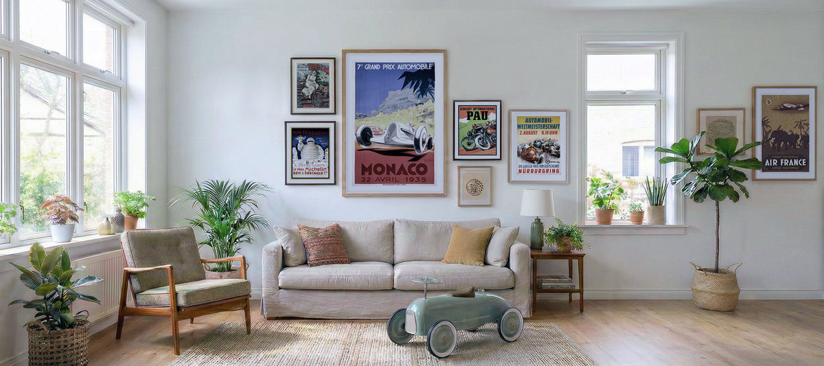
If you do build a gallery wall, start with a main piece and let the others support it. A central ship or car poster can set the tone, while smaller frames add rhythm. Keep frame finishes limited, such as black, natural wood or white, so the subjects remain the focus. Leave enough space between frames for each image to breathe.
When home interiors prints feel collected, they usually share one of three things: a subject family, a color relationship or a mood. Subject family might mean vehicles and travel. Color relationship might mean navy, cream and red. Mood might mean nostalgia, speed, craftsmanship or coastal ease. You only need one strong connection for the arrangement to feel deliberate.
Materials matter more than people think
A print’s subject creates the emotional response, but the material affects how it lives in the room. Thin paper, dull color or poor finishing can make even a good image feel temporary. Gallery-quality materials give the print more presence, especially in rooms where furniture and lighting have already been chosen with care.
Transit Art’s focus on gallery-quality poster finishes and FSC-certified paper fits this idea well. The goal is not only to fill a wall, but to choose artwork that feels considered. If you are building a room slowly, start with one piece you would still enjoy in five years, then add from there.
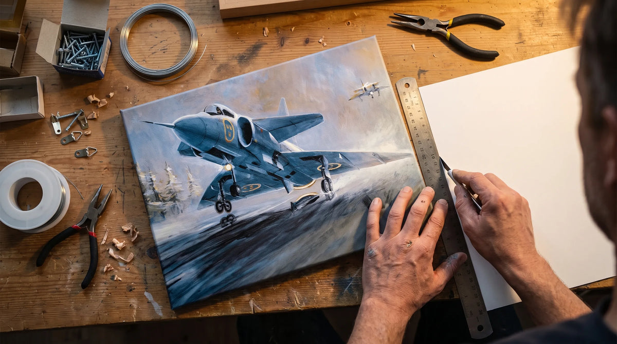
This is also where practical variety helps. Posters, canvas prints and smaller design objects such as mugs or mobile covers can carry the same visual world through a home without forcing every surface to match.
Frequently Asked Questions
How many home interiors prints should I use in one room? Start with one strong focal piece. If the room still feels bare, add a second or third print that shares a subject, color or mood. Most rooms feel more personal when the artwork has space around it.
Should prints match my furniture? They should relate to the room, but they do not need to match exactly. Echo one or two colors, then let the artwork introduce its own character.
Are vintage posters only for traditional interiors? No. Vintage posters often work beautifully in modern interiors because their graphic shapes, typography and color blocks add warmth to clean spaces.
What is the best place to hang a personal print? Hang it where you will actually notice it, such as above a desk, beside a favorite chair, in an entryway or over a console. Personal art is most effective when it becomes part of daily life.
Bring your walls closer to your story
The right print can change how a room feels without changing the furniture, paint or layout. Start with a subject that means something, choose a size that feels confident and let the artwork create a small moment of recognition each time you enter the room.
To explore vehicle-inspired posters, canvas wall art and transit-themed designs, browse the curated collection at Transit Art and look for the piece that feels less like decoration and more like part of your story.