Article: Choosing Vintage Posters by Illustration Style and Era
Choosing Vintage Posters by Illustration Style and Era
Choosing Vintage Posters by Illustration Style and Era
Choosing vintage posters becomes easier when you look beyond the subject. Two prints might both advertise air travel, yet one uses sweeping decorative lines while another relies on flat color and geometric shapes. Those differences determine how the artwork feels on your wall, whether your room is quietly minimal or filled with collected objects.
Start with the illustration style, then consider the era, the print’s status and its relationship to your interior. This approach helps you choose something you enjoy looking at, not simply something labeled “retro.”
First, Separate the Artwork’s Era From the Print’s Age
A historical design and a historical sheet of paper are different things. Before comparing illustrations, establish what the seller is offering.
- Historical original: A poster printed during its original advertising campaign or period of issue. Later authorized editions may also exist, so the edition matters.
- Reproduction: A newer print of an existing historical artwork. Its image may be decades old even though the paper and printing are recent.
- Retro-inspired design: A contemporary illustration that borrows the visual language of an earlier period without reproducing a particular historical poster.
None is automatically the best choice. An original offers a physical connection to its period, while a reproduction can make a favorite composition easier to display in everyday surroundings.
Treat “vintage” as a starting point for questions, not proof of age. A convincing distressed texture or old-fashioned typeface cannot establish when an object was printed.
Four Illustration Styles and the Eras Behind Them
When comparing vintage posters, use periods as visual reference points rather than rigid dating rules. Styles overlapped, traveled between countries and continued long after their first popularity.
Art Nouveau: Flowing Contours and Decorative Unity
Associated especially with the 1890s and early 1900s, Art Nouveau favors sinuous outlines, botanical forms and lettering woven into the illustration. Figures, borders and backgrounds often feel like parts of one continuous composition.
Choose this direction if you enjoy detailed surfaces and organic movement. It can soften a room with straight-lined furniture, particularly when the frame remains restrained. Look at the outline first: a flowing contour is a stronger clue than a faded cream background.
Art Deco: Geometry, Speed and Confident Shapes
Closely associated with the 1920s and 1930s, Art Deco frequently uses angular forms, streamlined silhouettes and sharply organized compositions. In transport advertising, diagonal viewpoints and simplified vehicles can suggest speed without depicting every mechanical detail.
This style suits enthusiasts who appreciate engineering as visual design. It also works with contemporary interiors because its clear shapes remain readable from across a room. However, an Art Deco-style motorcycle illustration is not necessarily a print made during that period.
Painterly Travel Illustration: Atmosphere Before Precision
Across the first half of the twentieth century, travel advertising often used illustrated landscapes, picturesque architecture and expressive color to make destinations desirable. Brushlike textures and softened detail can give these images a more atmospheric character than geometric transport graphics.
This is a useful direction for a living room where the destination matters more than the vehicle. Look for a convincing relationship between foreground and distance, rather than choosing solely because a place name holds personal meaning.
Midcentury Graphics: Simplification and Visual Economy
Many designs associated with the 1940s through the 1960s favor reduced shapes, flat color and playful changes of scale. Route maps and transport advertising can turn complicated information into an approachable visual arrangement.
For vintage posters in this direction, examine what the illustrator leaves out. A recognizable aircraft, coastline or city rendered with very little detail can be more effective than a busy scene. The uncluttered composition often pairs naturally with simple furniture and open shelving.
Check Age, Printing Method and Provenance Before Buying
For an original, ask for photographs of the complete sheet, its reverse and any printer’s marks or publication details. Request the dimensions, condition description and known ownership history. Repairs, trimming, backing and fading should be disclosed because they affect both appearance and collecting decisions.
Printing methods provide evidence, but rarely settle the question alone. Lithography was important to historical poster production, while offset printing also appears in twentieth-century material. A modern reproduction can imitate an older surface, and a historical poster need not be a stone lithograph. Expensive purchases warrant assessment by a specialist familiar with that particular poster.
For newly produced vintage posters, concentrate on image clarity, paper specifications and whether the listing accurately describes the artwork’s origin. Fine lettering and route lines should remain distinct at your chosen size.
Transit Art describes its prints as using gallery-quality materials and FSC-certified paper. Paper sourcing and historical authenticity are separate considerations; FSC certification does not establish an artwork’s age.
If you are considering a download instead, check both image resolution and the license. Being able to save an image does not necessarily give you permission to reproduce it.
Choosing Vintage Posters for a Modern Interior
Start with the wall’s role. Above a sofa, a poster needs enough visual presence to relate to the furniture. Beside a reading chair, a smaller, detailed illustration can reward closer viewing. A route map often benefits from a position where someone can comfortably approach it.
Match Visual Structure, Not Just Color
Pairing by era alone can produce an uneven wall. Two contemporary reproductions of historical designs may work beautifully together if they share a strong diagonal, similar border proportions or comparable amounts of empty space.
Choose one connecting feature and allow some variation elsewhere. A colorful map and a restrained vehicle illustration can coexist when their frames and outer dimensions create order. Avoid adding artificial yellowing simply to make every piece look equally old.
If lettering dominates your shortlist, Transit Art’s guide to choosing artistic posters with bold vintage typography offers a complementary way to assess visual hierarchy.
Frame for the Artwork and Its Setting
A narrow black frame emphasizes graphic outlines; a simple wood frame can introduce warmth without competing with the illustration. Use matting when the composition needs breathing room, rather than assuming every print requires it.
For preservation, follow the Library of Congress guidance on caring for works on paper: limit light exposure and use appropriate protective materials. UV-filtering glazing helps, but it does not make direct sunlight harmless.
Recommended Poster Pairings
A coherent group does not require identical subjects. These three transport designs offer different ways to balance information, movement and illustrative detail. When pairing vintage posters, let one piece lead and give its companion a supporting role.
Start With the Avianca Route Map
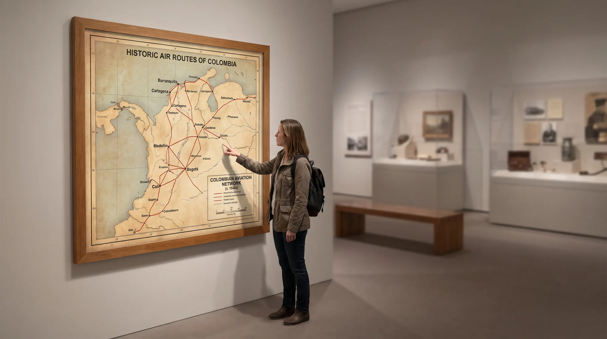
The Vintage Avianca Map Poster Highlighting Colombian Flight Routes organizes its subject around a vibrant map of Colombia, a network of domestic routes and an inset globe.
Colombia’s mountainous geography gives the aviation theme particular resonance: flight connects places separated by substantial terrain. Visually, the network of lines turns the map into more than a geographic reference. It becomes an image of connection and movement.
This makes a thoughtful anchor for an aviation enthusiast’s office or a travel-focused reading corner. Choose it for its cartographic character, without assuming that the route network or illustration style proves a particular publication date.

Add an Art Deco-Style Cycling and Motorcycle Scene
The Vintage Favour Cycles & Motorcycles Poster features a motorcyclist racing ahead of a cyclist in an Art Deco-style composition.
Alongside the Avianca map, it creates a contrast between plotted journeys and depicted motion. The map invites close inspection, while the riders provide a more immediate narrative. The shared transport theme connects them without requiring matching vehicles.
This pairing suits a home office or hallway where each print has room to read independently. Use a consistent frame finish and align the frame centers if the prints have different proportions. Let the contrast in illustration carry the arrangement rather than adding more decorative objects around it.
Use a Racing Composition as an Alternative Companion
For a broader celebration of motoring culture, consider the Vintage Racing Poster, which brings together racing helmets, a motorcycle and a race car in an early-twentieth-century-style illustration.
Pair it with the Favour design when your interest is the relationship between two-wheeled and four-wheeled competition. Together, they offer more subject continuity than the map-and-motorcycle combination.
A study, hobby room or informal living space is a natural setting. Compare the actual product images before ordering: shared subject matter helps, but the balance of color and detail still needs to suit your wall. Treat this as an alternative two-print arrangement rather than automatically combining all three.
Frequently Asked Questions
How can I tell whether a poster is genuinely old? Ask for the printing date or edition, dimensions, condition report and supporting provenance. Paper discoloration alone is not reliable evidence. For a valuable original, seek an independent specialist’s assessment.
Do vintage posters have to match the age of my furniture? No. Match their visual qualities instead. Geometric illustration can work with contemporary furniture, while a decorative composition can add contrast to a restrained room.
Is a reproduction a sensible choice for home decor? Yes, provided it is accurately described and well produced. It lets you prioritize the image, scale and room setting without treating the purchase as an acquisition of a historical artifact.
Can different illustration eras share a gallery wall? Yes. Connect them through framing, composition or subject matter. Two pieces with a clear relationship are often more convincing than several chosen only because they belong to the same decade.
Choose the Illustration You Want to Live With
The most useful question is not simply “How old does it look?” Ask what holds your attention: a flowing contour, a streamlined vehicle, an atmospheric landscape or the intricate connections of a route map.
Once that preference is clear, check what kind of print you are buying and choose a scale that suits its setting. A considered transport print can express an enthusiasm while still feeling like an intentional part of your home.