Artikel: Choosing Modern Artwork for a Home With Warm Wood Tones
Choosing Modern Artwork for a Home With Warm Wood Tones
Warm wood makes a room feel inviting, but choosing modern artwork for it takes more than finding a print with matching brown tones. Oak floors, walnut cabinets and teak furniture already bring color, grain and visual movement into a space. The right artwork adds something different: a clearer focal point, a contrasting shape or a subject that makes the room feel personal.
For transport enthusiasts, a sepia automotive print offers an appealing connection between craftsmanship and contemporary decorating. The challenge is to preserve that warmth without letting the entire room blend into one brown backdrop.
Start With the Wood’s Undertone
Before choosing a print, look at your largest wood surfaces in daylight. Is the oak golden, the walnut reddish or the teak distinctly orange? Wood species alone will not answer that question, since finishes, age and lighting change how each piece appears.
Use the dominant undertone as a starting point, not a rule that every accessory must follow.
| Wood appearance | Useful artwork direction | What to watch for |
|---|---|---|
| Pale, honey-colored oak | Sepia imagery with clear dark details and lighter areas | Beige artwork disappearing against a cream wall |
| Deep brown walnut | Prints with enough light-dark contrast to remain distinct | Dark artwork merging with dark furniture |
| Reddish or orange-toned teak | Restrained sepia or black-and-white imagery | Too many competing orange and red accents |
| Mixed warm woods | A limited artwork palette and consistent framing | Adding another strongly contrasting wood finish |
You do not need to neutralize the wood. Instead, decide whether the artwork should echo its warmth or introduce a visual pause.
Choose Modern Artwork for Contrast, Not Just Color Matching
In decorating, “modern” often describes the overall presentation rather than the age of the subject. A photograph of a vintage automobile can feel entirely at home above a streamlined sideboard when its palette, scale and framing are considered carefully.
This differs from Modern art as an art-historical category, commonly associated with movements such as Cubism and abstraction. For this room-focused approach, the aim is a contemporary-looking interior, not a requirement to choose work from a particular movement.
A sepia print can connect naturally with timber, but it still needs separation from its surroundings. Look for differences in lightness: pale areas against a dark cabinet, darker details against a light wall or a contrasting frame around a predominantly brown image.
Let the Grain Set the Level of Detail
Highly figured wood already supplies a busy pattern. Above a cabinet with prominent grain, give a detailed automotive image generous wall space rather than surrounding it with several small pictures.
Quieter wood surfaces can accommodate a more layered arrangement. A smooth oak desk, for example, provides a restrained foundation for two related transport prints.
The best modern artwork for a wood-rich room does not repeat every existing texture. It gives the eye somewhere distinct to settle.
Why a Classic Bugatti Works With Warm Timber
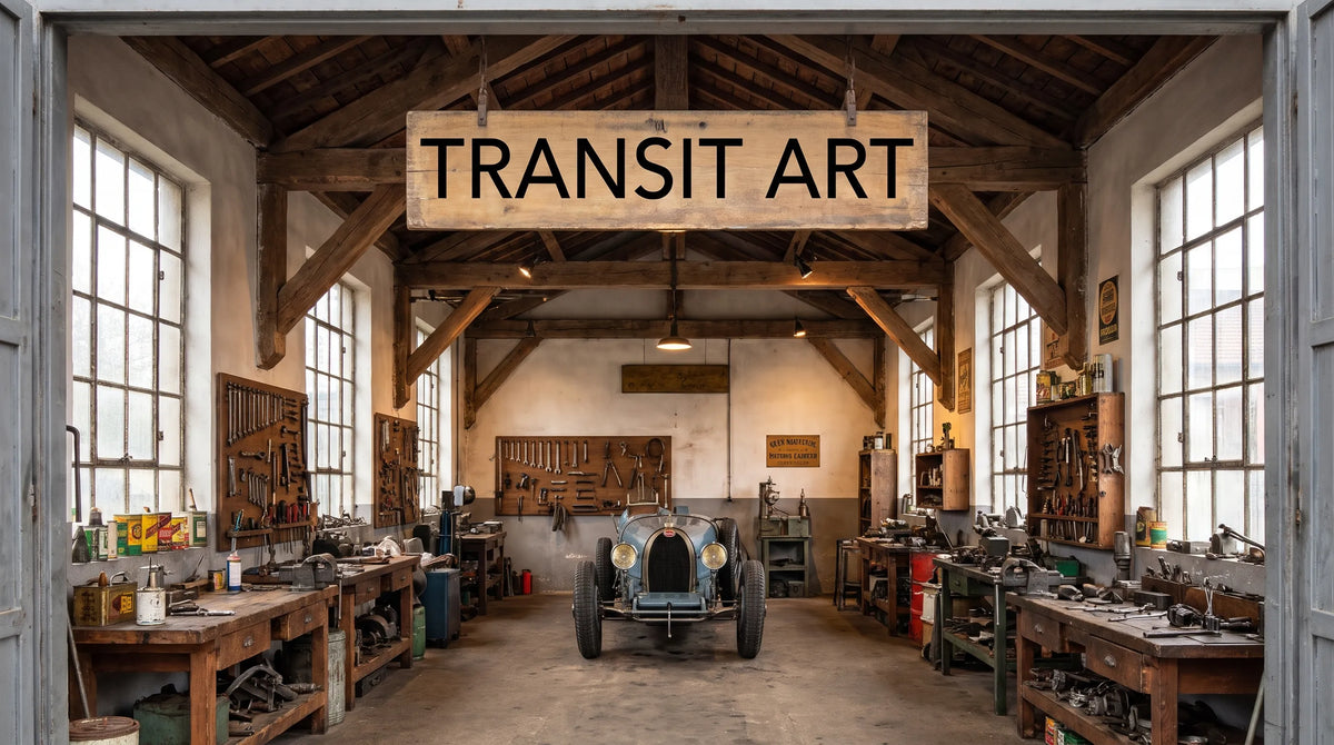
Transit Art’s Bugatti in garage - Sepia depicts a classic Bugatti inside a garage. Its sepia treatment makes it a relevant starting point for interiors furnished with warm wood, while the automotive subject adds an interest beyond the room’s color scheme.
Ettore Bugatti founded the marque in Molsheim in 1909. During the 1920s and 1930s, Bugatti became associated with exceptional engineering, competition success and elegant automobile design. The celebrated Type 35 helped establish its racing reputation, while the marque’s road cars demonstrated an equally strong concern for proportion and craftsmanship.
That background explains why classic Bugattis appeal to more than racing enthusiasts. Their combination of mechanical purpose and sculptural form also attracts people interested in industrial design, engineering history and carefully made objects.
Connect the Subject to the Furniture
A timber cabinet and a historic automobile are very different objects, but both can invite close attention to materials, construction and proportion. That connection makes automotive art feel intentional rather than like a themed accessory added at the end.
For someone choosing modern artwork around a personal interest, the garage setting also offers an alternative to overt racing imagery. It places the vehicle in a context of maintenance, storage and mechanical appreciation, making it particularly fitting for a home office or reading corner.
Interior Design: Get the Frame, Scale and Lighting Right
Use the Frame to Create Separation
A slim black frame is a useful option when a sepia image sits above warm wood. It creates a clear edge without adding another timber tone. Repeat that dark accent elsewhere through a lamp, cabinet handle or chair detail so the frame feels connected to the room.
A wood frame can also work, but matching it approximately to a nearby cabinet is not always successful. A visibly different finish often looks more deliberate than two almost-matching browns.
If you choose a mat, a soft off-white can provide breathing room between the image and frame. Compare samples beside the actual print: a strongly yellow mat may make an already warm arrangement feel overly amber.
Size the Artwork Against the Furniture
Above a sideboard or sofa, use the furniture’s width as a reference. As a starting guideline, an artwork or grouped arrangement spanning around two-thirds of that width often feels balanced. This is a proportion to test, not a fixed rule.
Mark the proposed outer dimensions with removable painter’s tape before ordering. Include the frame and mat in that measurement, and check the arrangement from the doorway as well as from your usual seat.
Leave visible wall around the piece. A print squeezed between a tall plant, a lamp and a shelf rarely reads as a focal point.

Test the Light Before Committing
View your proposed location during the day and after dark. Warm lamps can make sepia imagery appear more amber, while reflections from windows may obscure details behind glazing.
Avoid direct sunlight where possible, and follow the care guidance for the selected print and framing materials. Protective glazing can help reduce exposure risks, but it does not make artwork immune to fading.
If the room already contains many creamy neutrals, the related guide to contemporary prints in a neutral living room offers another perspective on introducing contrast without adding strong color.
Recommended Poster Pairings
A cohesive pairing needs a shared visual principle, not necessarily two identical subjects. When combining modern artwork above warm timber, connect the pieces through framing or palette, then let their differences provide interest.
These two Transit Art selections offer a transport-focused starting point. Check their current dimensions and format options before planning the final arrangement.
Bugatti in Garage - Sepia as the Warm Anchor
Use the Bugatti print as the warmer member of the pairing. Its sepia palette relates to timber, while the garage subject introduces automotive history into the room.
It is particularly suited to a position above a walnut sideboard or beside an oak desk, where the furniture establishes a clear visual base. Keep nearby objects simple: a reading lamp and one ceramic vessel may be enough. Several miniature cars, signs and mechanical ornaments would shift attention away from the artwork.
SAAB JA37 Viggen as the Black-and-White Counterpart
Transit Art’s guide to pairing the SAAB JA37 Viggen canvas with modern furniture features a black-and-white aviation work that offers a contrasting direction.
Paired with the Bugatti subject, it creates a connection through transport design rather than matching vehicle types. The monochrome palette introduces a cooler-looking pause beside sepia, which can be useful in a room already rich in brown furniture.
This combination suits a home office or shared study where interests extend across automotive and aviation design. If you select different formats, such as a poster and canvas, coordinate their placement rather than assuming they need identical framing. Give them a shared centerline and enough space to read as two distinct works.
Adapt the Arrangement to Your Room
In a Scandinavian-inspired living room with pale oak, let the artwork supply the darker accents. A restrained frame, light walls and a modest number of accessories keep the result open rather than rustic.
In a room with teak furniture, reduce competing warm accents around the picture. You may not need an orange cushion, brass ornament and sepia print all grouped in the same corner. Keep the elements you value most and give each some space.
For a walnut home office, modern artwork can prevent the furniture from making the room feel visually heavy. Prioritize a clear silhouette, lighter surrounding wall space and a position that remains visible once books, lamps and everyday objects are in place.
Frequently Asked Questions
Does sepia artwork make a room with wood furniture look too brown? It can if the wall, frame and furnishings all have similar tones. Add separation with a darker frame, lighter mat or more open wall space rather than abandoning the sepia palette altogether.
Can vintage car imagery work in a modern interior? Yes. A historic subject can feel contemporary when it is presented with restrained framing, appropriate scale and uncluttered surroundings. The subject’s age does not determine the room’s style.
Should every frame match the furniture? No. Frames can relate to other details, such as dark lighting fixtures or metal hardware. Introducing contrast is often more convincing than attempting an imperfect wood match.
What should I check before ordering a print? Confirm the selected size, format and framing details on the product page. Measure the full intended display area, and consider the wall’s lighting and proximity to direct sunlight.
Choose a Subject You Want to Live With
Warm wood already gives a home character. The purpose of modern artwork is to add another dimension, whether that is a personal interest, a contrasting palette or an appreciation of design history.
For a Bugatti enthusiast, the sepia garage print offers a natural connection between automotive craftsmanship and timber furniture. Start with the subject that matters to you, test its scale on the wall and choose a presentation that lets both the artwork and the wood remain distinct.